Composition

Composition
Composition is the art of arranging the subject in an appealing manner. Both the image’s background and foreground must balance with the subject in an orderly manner. This art form portrays what’s important to you in the image that you have created. Take the time to identify what you want to express. Once the subject is selected, take the time to stop and frame the shot.
First choose the subject and then simplify the picture. Clearly define the scene and eliminate any visual clutter that distracts or dilutes your image.
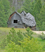
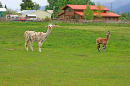
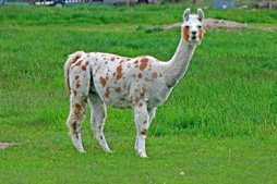
Composition calls for a conscious, deliberate choice of subject matter. You control the shot by selecting a precise camera placement that organizes the image in the frame. You take into account the main factors such as color, texture, pattern, lines, and form. The final image will be a graphic arrangement of the elements.
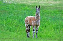
Ask yourself why you are taking this photo. What is it that has caught your creative eye? Where is the best place to photograph this form? What is the right light? Does the background detract from the image?
Good composition is very subjective. Try to please yourself by capturing the image that your unique vision has perceived. Choose how loosely or tightly you want to frame the subject. Define exactly what you want to include and exclude. Apparitions are the little things that seem
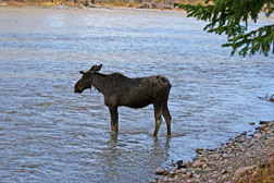
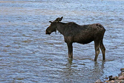
to appear from nowhere. Check out the photo’s edges and eliminate objects that do not seem to be attached but are simply floating in space. Any unclear framing can quickly confuse your viewers. Simplify your picture and define it clearly; eliminate what you do not want to show.
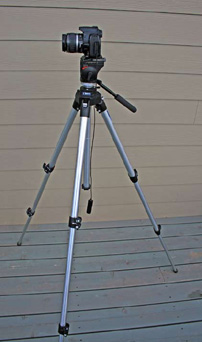
Walk around your subject and find the best location to capture it. Try low and high positions other than the standard eye level perspective. Once you have found the best possible camera placement, set up your tripod and frame the picture with precision. The tripod allows you the time to carefully inspect and to fine-tune your photo.
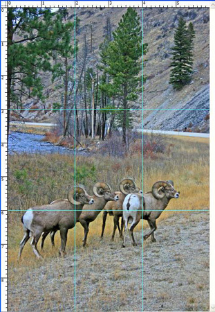
Next take into account the rule of thirds. Following this rule will quickly improve the composition of your photos. Simply divide up your picture into a tick-tack-toe grid. The two horizontal lines are in the lower and the upper third of the frame. These two lines serve as guidelines to place the horizon of your landscape photo. The four intersections are the best locations to place your subject.
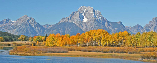
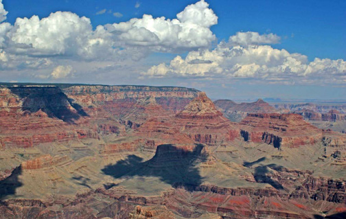
In landscape photos the sky horizon is placed along either of the two horizontal lines. If the sky is interesting, place it along the bottom line. This will emphasize the interesting clouds or sunrise/sunset features, but if the sky is featureless place the horizon on the top line. Many times the sky can be a dull gray. De-emphasize this boring sky by placing its horizon above the top line. In some cases the sky can be so dominant it’s better to compose
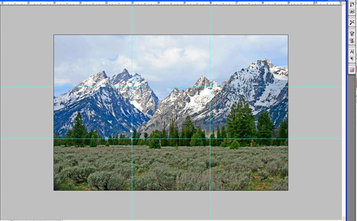
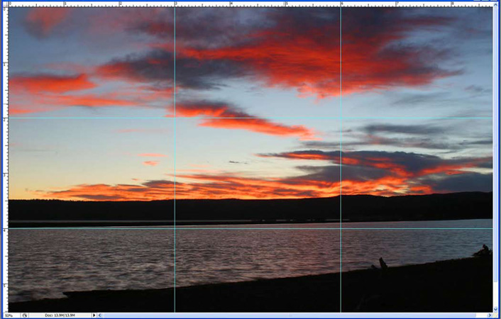
its image by placing the horizon below the bottom line. Also, when the land features are intense, emphasize them by placing the horizon above the top line. So carefully observe the sky and the land to see how much of it you want to show in your composition.
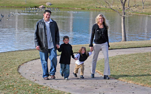
Your subject’s strongest placement is at one of the four intersections in the frame. Experiment with your camera firmly in the tripod and place your subject at one of these four intersections. Select the one that you like the best. When placing people or animals, always position them so they are moving or looking into the frame. This gives them room to appear to move and to breath. Then they will not appear to be congested or crowded into the image’s edge.
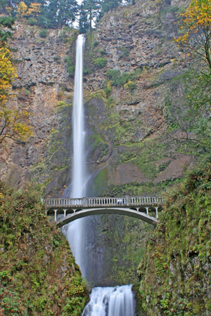
However, there are exceptions to every rule: on occasion a symmetrical subject is best placed in the middle of the frame. This will clearly show off its symmetry. An example would be looking up a stairwell where both sides are equal. Remember there are two ways to frame the photo: the horizontal or the vertical format. Nearly all of us use the horizontal frame way too much. Experiment by taking the photo in the vertical format and then in the horizontal one. Carefully observe the results. The rule of thirds works in the vertical format but now the intersections are in different places than they once were. Use them to format your subject.
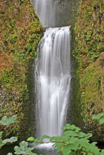
Horizontal formats are usually the most dramatic ones for grand scenic photos while the vertical formats are best for portraits because they eliminate clutter from the surrounding area.
The horizon should be level. A crooked one bothers the eye and quickly detracts from the composition.
Photos that are three dimensions are preferred for landscapes. Two dimensional photos only portray width and length while three dimensional ones add depth. This depth is easily
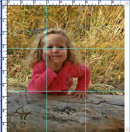
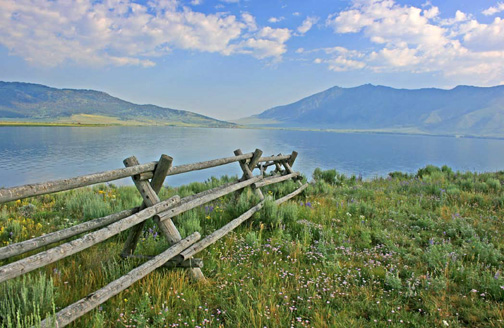
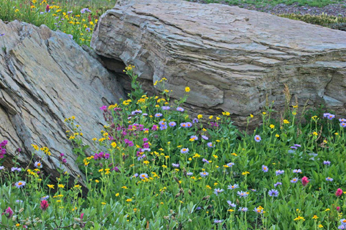
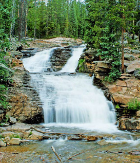
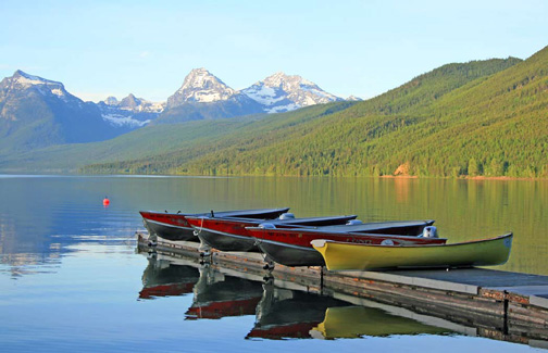
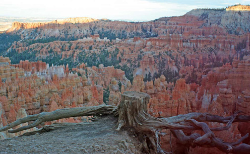
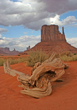
added by clearly focusing and including a foreground that is of interest. This strong foreground feature grabs your attention and pulls your eyes into the photograph. To capture this use a wide angle lens with an f16 to f30 aperture. Place this lens close to the foreground so it and the background are clearly in focus. Sometimes the far background can be a little out of focus. This

will make the landscape appear to have great depth. Simply move the camera around to find the best place to add the strong foreground feature. Sometimes a lowered tripod will really make this third dimension stand out. Perhaps a rule would be the closer you are to your foreground subject the more interesting and dynamic your composition will become. A strong foreground that is in crisp focus really makes a great landscape image.
Try to simplify your composition. Whenever possible less is almost always more in a quality photo. Remove any clutter that may distract. Carefully choose the best camera placement. Use fewer elements to best portray your subject and discard unwanted background clutter.
Manipulate the camera’s position so the shape of your chosen image is attractive in your shutter; change the lense’s focal length to help best capture this shape. Train your eyes to see the shape that you want to show.
Balance and weight take into account the shape, size and position of your subject. Balance is the relative weight of a composition. It can be symmetrical or asymmetrical. Balanced photos are pleasing to the eye. Try to match up the weight by equalizing the sizes and shapes of asymmetrical objects. For example, a large foreground tree trunk can help balance a winding path in the background. Their weights appear equal. Symmetrical subjects are easy to balance. Simply place them in the middle of the frame and their sides are like mirror images of each other.
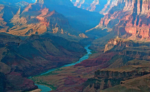
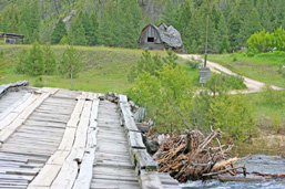
Lead-in lines help direct the eye to the subject and lead-out lines help to direct the eye away from the subject. If you can use both of them in your landscape photo you will have a winner.
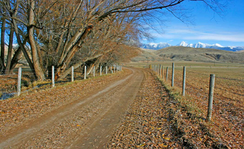
These lead-in lines can be rivers, creeks, fences, trails, roads and railroad tracks. They are best placed at the bottom of the photo. Lead-out lines help take the viewer out of the scene and lead-out lines connect with the opposite edge of the photo. If you use only lead-in lines, the viewer’s eyes may sometimes become trapped in the dominant feature of your photo.
Lead- in and lead-out lines adds a fourth dimension of time. They act like stepping stones that you can follow to direct your eyes into and out of the scene.
Curved, straight and parallel lines create pleasing effects. An S curved fence, trail or stream takes your eyes on a visual journey through the scene. Parallel lines are also pleasing to the eye and attract attention. A curved dirt road with parallel tracks is a visual aide; but some lines can cause tension in a photo. Diagonal and unparalleled lines can introduce asymmetry. Perhaps this tension is what caught your attention to the composition. This may be what you intend to portray.
Composition comes from you. It is what you want to show. As you can see it requires some effort to best capture a well composed image. Slow down and take the time to best show off what you have seen. Add these little things to your photo for these little things quickly add up into improved images.
